Lite BOA
Overview
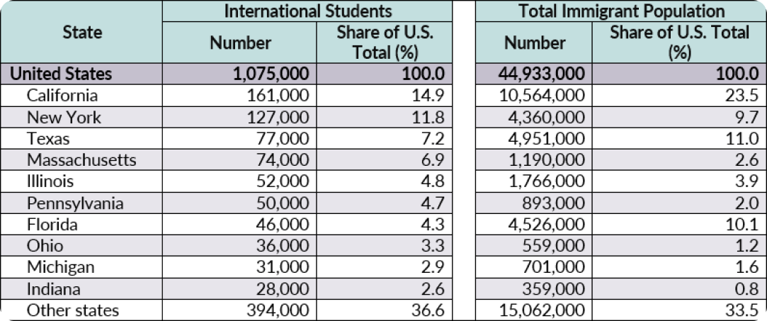
Business digital adoption has increased dramatically in recent years. Banks promote remote services, sales, loans, and mortgages through computer and mobile apps; statistics show that the banking industry has the most digital adoption globally (Baig et al., 2020). According to FWD.US (2022), more than 1 million international students are studying and living across the US as the Millennials and Z generation. They have different needs and internet-using habits than the rest (Struk, 2022).
This project is my passion project to redesign a mobile banking app to improve the younger generations’ efficiency and productivity in managing their financial activities and affairs.
Duration
2 weeks
Team
Sole Project (Passion Project)
My Role
I took the entire part from User Research, User Experience, and Visual Design.
Tool
Figma

How can redesigning fin-tech mobile applications improve efficiency and productivity for Millennials to manage their financial activities/affairs?
Mission
Renovating BOA’s mobile lite version to streamline the app’s usability and provide a convenient end-to-end experience for the Millennials and international students.
Competitive Analysis
PayPal
Pros (PayPal.com & Miller, 2022 & Jones, n.d.):
Easy to use and straightforward (Simple sign up, Send, spend and manage money)
Broad acceptance: Send money fast through 200+ countries, easy to buy stuff online
Manage all in one place
Give extra security by using PayPal when encountering a fraud
Protect personal information
No fees for transferring money through personal accounts.
International transaction: easy to reach more potential customers by accepting international payments in major currencies
PayPal enables users to transfer money quickly through friends, family, business associates, etc.; the use of the app is simple as setting up an account for free, verifying the account, and attaching a bank account (Miller, 2022). PayPal Credit is a credit card service without a physical card, and PayPal cash is where it saves users money inside of the PayPal account without transfer back to the original bank account. Notably, PayPal allows the international transfer of funds between more than 200 countries by simple actions and can choose the currency a user wants to convert their money into easily through the app (Delfino, 2019).
Cons:
Associate fees with a business transaction and immediate transfer money to the bank account
A lot of online fraud involving with PayPal transaction
The dashboard has many functions and might be confusing
The icons below the app are confusing and cannot represent functions clearly
The hierarchy is not clear in the app.
Interfaces:
Welcome interface
Sign up/ sign in (with fingerprint verification)
Dashboard (manage, send and request money, more-order, offers, denote)
Finances
Payments
Deals
Wallet
Usability and Internationalization
People from different countries have special needs in a user interface design project; International usability significantly impacts designing a good app (Aykin, 2016). Multilingual sites and time/dates increase international usability(Aykin, 2016). Only 8% to 10% of people in the world speak English as their primary language, and many people in the United States speak a different language than English as their native language, as 49% in Los Angels, 42% in New York, and 45 % in San Francisco (Aykin, 2016). The industry should increase internationalization based on user needs, business needs, and technology considerations, accommodating various languages, navigation structures, text expansion, and contents. The product should be free to any culture (Aykin, 2016).
Comprehension Research
Testimonial - blogger / Tech reviewer
Key Features (Luthi, 2021):
The app makes it easier to track spending and manage various aspects of the account. The BankAmeriDeals and real-time alerts are beneficial to the users, and they respond to the situation fast.
Login and security
Account alerts
Payment options
Reward redemptions
Credit score access
Spend Tracking/ Manage investments
Current BOA mobile app functions (Payne, 2022):
Manage all BOA bank accounts
Make money transfers
Pay bills
Make check deposits
Contact BOA supports
Make appointments with BOA experts
Locate ATMs and banking institutions
Activate or replace debit and credit cards
Order checks
Set up phone notifications
Cashback deals
User feedback - App store / Google store
User feedback 2
Auto payment methods
Forget the password and the complex process of logging back in
Agent lines are busy and challenging to access.
The online experience is terrible.
User Feedback 1
New ‘Bill Pay is poorly designed. Bad UI and does not match the rest of the app
Bad user experience and complicated to use through multiple screens and various clicks
Confusing
No automatically payment dates, and not able to delete old contact information
User feedback 3
The AI support system could not recognize linguistics.
Credit line rebuilding problem
User feedback 5
Bill Pay is problematic
No AutoPay set up
Cannot pull up a list of payments
Bad view on Ipad
User feedback 4
The Alert feature is good, but closing the acknowledge information needed to log in is complicated
Difficult to check the activity history of a credit card
When making a payment on the credit card, the screen goes back to the payment screen
No evidence of payment is scheduled or made
Usage analysis by myself
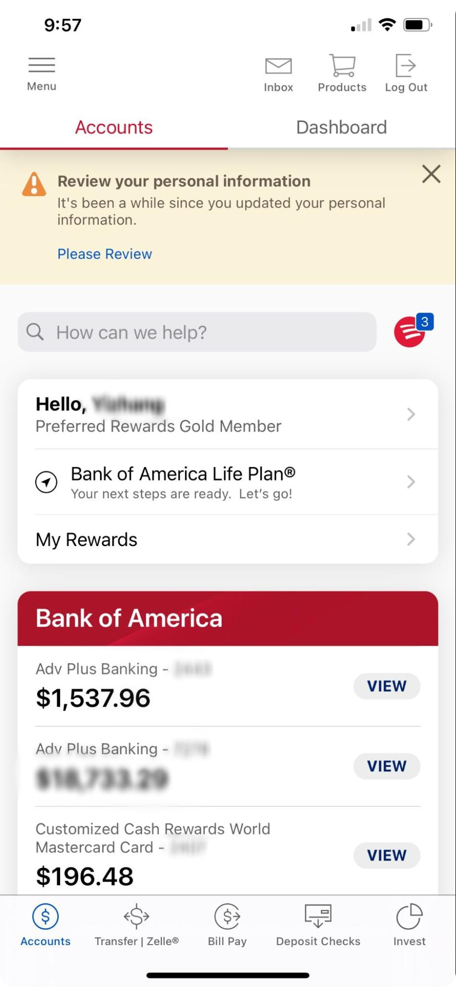
Login Interface
The login page is clean to me. When I read the reviews about the app from the Apple store, I saw people commenting on its acknowledge page is complicated. In the newest version, designers fix this problem. The upper part of the design, as username, password, and set up Face ID features are clean, and people can use face ID as an easier way to log in to the account. The bottom part is slightly confusing, as the advertising is not so useful for people who have already downloaded the mobile apps and are users’ who already have the accounts and are expecting to activate their accounts and manage financial activities.
Bank account
There is too much information in the bank account interface. And the icon on the right upper side seems repetitive, and I cannot understand the meaning of the icon by looking at it. How can we help? The Bank of America life plan feature is not as important as the account management. The priority and hierarchy of it can be re-organized. Below the account information, credit card offers, and appointments can cooperate with the AI chat box. The deals below the image have more information and meaning but might need to separate from account information.
Transfer| Zelle
The transfer and Zelle features are similar to the Bill pay function. One of the essential features for users to use is to transfer money and make a payment. It is difficult for me to separate functions through the current app’s navigation. Activity, recipients, and settings have different priority levels, as settings might be less important or can be put on a separate page.
Bill pay
The information here is not clear to the user. It might confuse people. The activity sub-interface might be combined with the main level interface. Too many subpages. Each action requires transit to a different page. Multiple pages are included in this function.
Deposit Check
The deposit checks interface is straightforward to navigate, although the block design is not fully aligned with the rest of the pages. It has the function of depositing from the selected account. The account information can be near the deposit function. The block design is not fully aligned with the rest of the pages.
Investment
The invest interface has less functionality in terms of managing financial activities. Working with an advisor is repetitive in the account information section. Let’s meet is similar to the AI chatbot feature. The target user group, international students, has fewer opportunities to utilize those functions.
Matrix
Bank of America mobile bank has a large user group worldwide and a great international using market. From the figures below, it ranks #94 in the entire google play store app and ranks #9 in finance categories, yet its usage rank is still increasing. Users who use the BOA mobile app also often use communication, finance, shopping, and tools. Most users will search keywords such as “bank of America login, app, mobile, online through the search function in google play (Bank of America Mobile Banking Stats: Ranking in google play, downloads & users 2022).
Additional Research: How AI component is used in mobile banking app
Future trends of AI bank features are from three perspectives (seeing figure below): intelligent, personalized, and omnichannel (Biswas et al., 2021). Banks need to reimagine how to engage with customers to provide integrated and personalized products and experiences than standardized products and help manage multiple cards and accounts (which, when, and how to pay). The bank should also embed the AI customer journey through various systems and platforms to provide a point-to-point experience to increase user engagement and usage. Movereve, banks need to rethink customer experiences and journeys from different moods.
Target Audience
Primary Target Audience
Millennials and the younger generation
Secondary Target Audience
Domestic and international students
Persona
Demographics
According to FWD.US (2022), more than 1 million international students are studying and living across the US as the Millennials and Z generation.
Only 8% to 10% of people in the world speak English as their primary language, and many people in the United States speak a different language than English as their native language, as 49% in Los Angels, 42% in New York, and 45 % in San Francisco (Aykin, 2016).
There are approximately 44 million immigrants in the United States (White, 2022).
Revenue model
International money transfer is a large and competitive industry (Mauro F. Romaldini, 2017).
BOA has fewer international money transfer volumes than other banks (SaveOnSend, 2017)
Pain Points
Priority-oriented
Task-oriented
Impact comparisons
Ideation
User experience ideas
App’s user flow
Wireframes
Login page
Home page with transition history
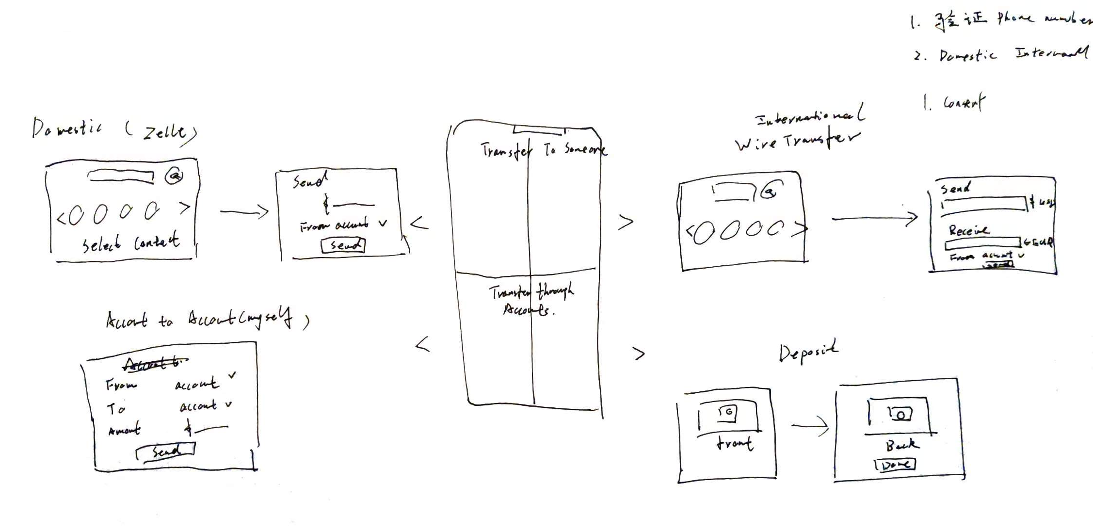
Transition page (Domestic transfer, internation transfer, account to account transfer, deposit functon)
Notification Page
Finalized Design
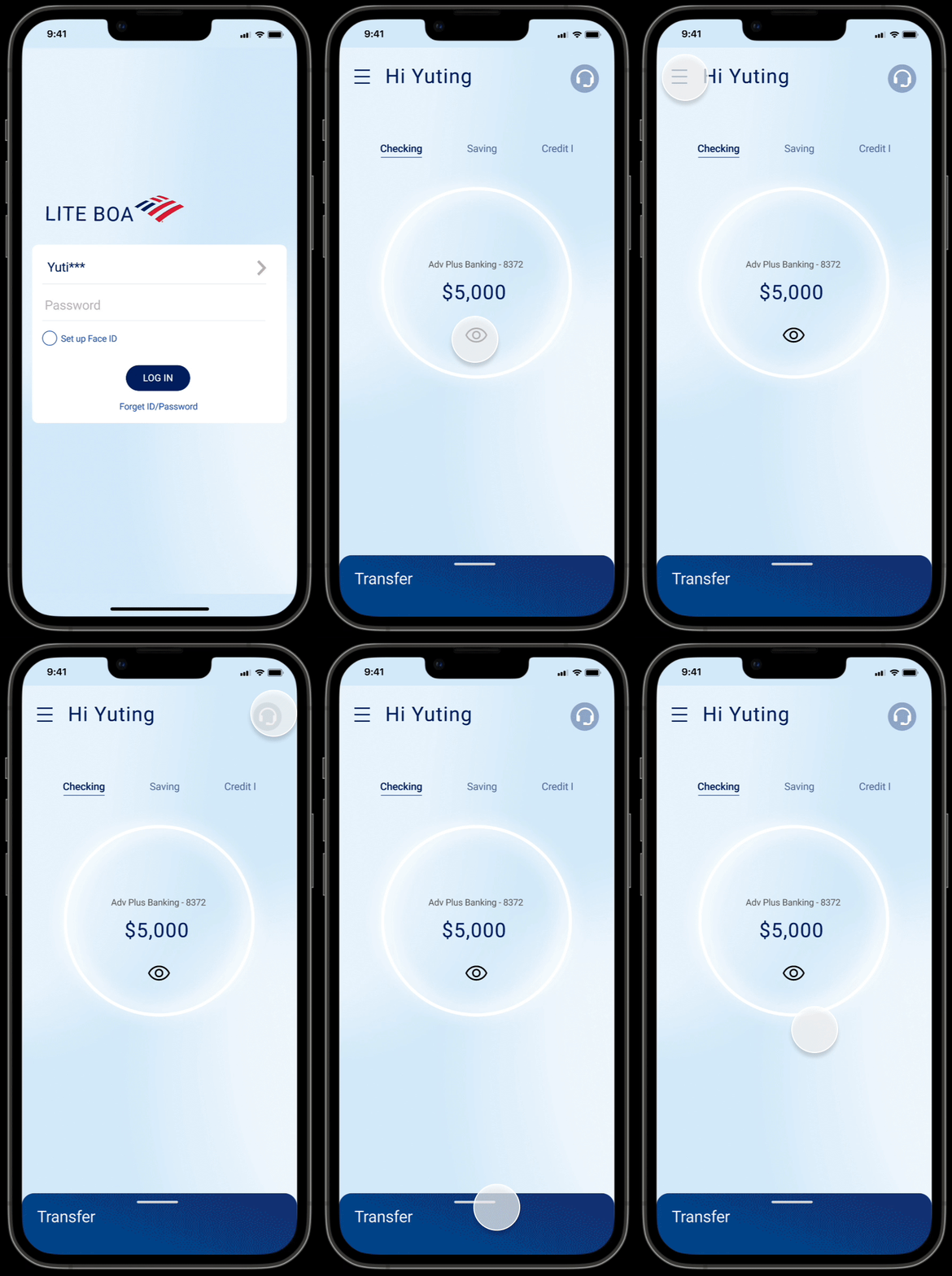
Main flow
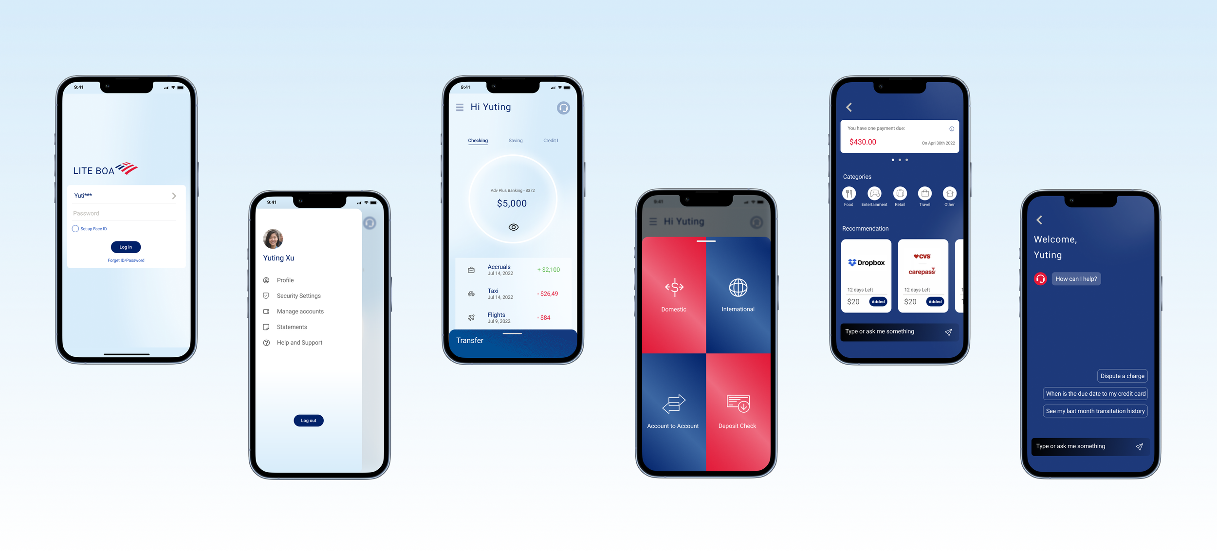
A simplified user interface to provide users with a more efficient user experience.
Transfer subflow
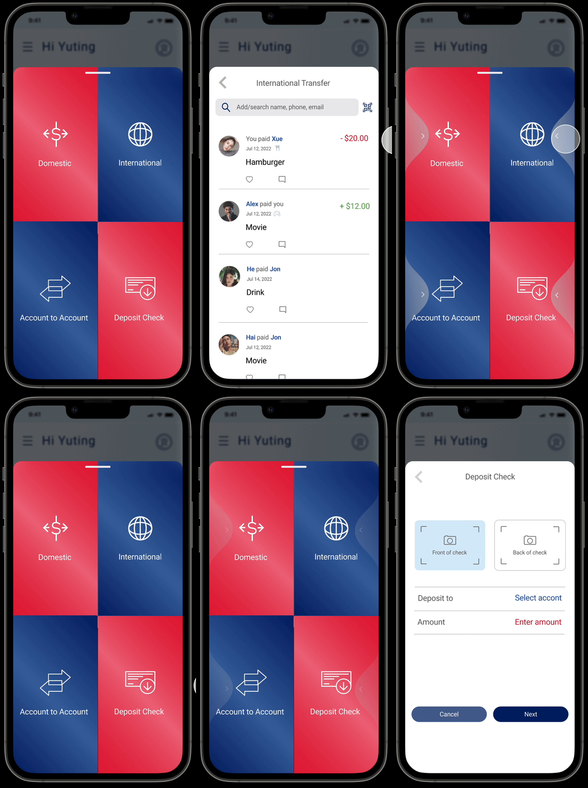
The payment features are re-organized into easier and simple formats. The consumer can easily swap left or right to find the transaction method they need to use. Each transaction has direct information that makes its clients easy to follow and make transactions.
Account display
The account display is the first screen a user will see once they log into their account. This page will be the main display of the user’s checking, saving, and checking account information. It is also the main access point to account setting, AI support, and transfer interfaces. The user can click the “eye” button to view the transition details on the account page.
Simplify the user experience and transit money process, and prioritize essential features
Money transfer
The draw component at the bottom of the main page is the main access point to the money transaction interface. This draw component is divided into four modules, domestic transfer, international money transfer, account to account transfer, and deposit check. The two upper side modules are functions that transfer money to someone. The bottom two modules are functions that transfer money within the client themself.
The consumer can easily swap left or right to find the transaction method that they need to use.
UI aligns with BOA Branding Style and Millennial generation digital using habits
Transaction process
Organize the payment features
The payment features are re-organized into easier and simple formats. Each transaction has direct information that makes its clients easy to follow and make transactions.
International transfer
The payment methods are re-organized in a more direct format. International transfer only has two interfaces. The first is to find the international accounts that have been verified on the online version of the BOA banking on a user's computer. The second step is setting up the currency and transferring money to the chosen verified account.
Simplify the international money transfer process
AI support
A better way to support target customers
AI support systems help clients in three dimensions - notification, recommendation, and support. The first is a notification that reminds a client of due payments, scheduled payments, and suspicious transaction activities. The second is a recommendation that recommends new coupons by categories and automatically adds coupons that a client might be interested in based on their shopping and using behaviors.
Design System
Next Steps
User testing is needed to keep developing the useability and version of the app. This project still has its limitations. The transaction process must be communicated and confirmed with the bank’s policy and procedure. The verification of the international accounts needs more research. I hope this lite version of the banking app can someday come true and help users get a better and more efficient experience.


